Imagine reading a scary horror story, but the text is written in a bright pink, bubbly comic font.
It wouldn’t feel very scary, would it?
That is the power of Typography.
Typography is the art of arranging letters and text in a way that makes the copy legible, clear,
and visually appealing to the reader. Just like colors, fonts have an emotional voice. They tell
the reader how to feel before they even read the words.
Let’s break down the rules of typography into simple, actionable steps.
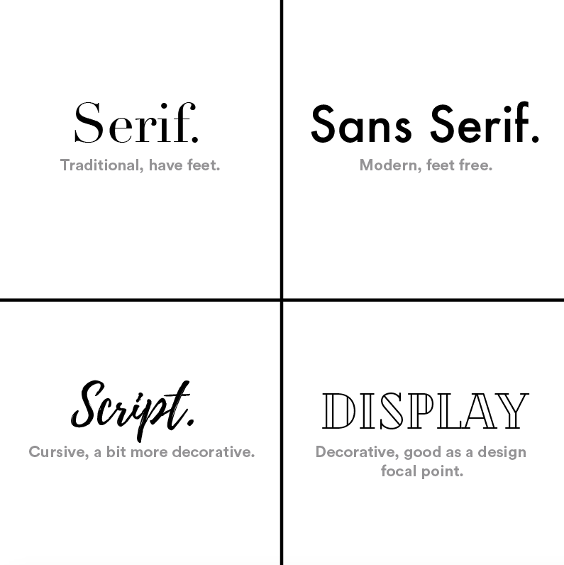
1. The 4 Main Font Families You Need to Know
Almost every font you see online or in print belongs to one of these four basic categories.
Understanding them makes choosing fonts incredibly easy:
A. Serif Fonts (The Traditional Choice)
Serif fonts have tiny decorative strokes or "feet" at the ends of their letters.
The Vibe: Classic, trustworthy, official, and traditional.
Best Used For: Long blocks of printed text (like books or newspapers) because those
tiny feet help the eye slide smoothly from letter to letter.
Famous Examples: Times New Roman, Georgia, Garamond.
B. Sans-Serif Fonts (The Modern Choice)
"Sans" means "without" in French. So, Sans-Serif simply means fonts without those tiny feet.
They feature clean, straight, geometric lines.
The Vibe: Modern, clean, minimalist, and tech-forward.
Best Used For: Digital screens (websites, smartphones, apps) because clean lines
are much easier to read on a glowing display.
Famous Examples: Arial, Helvetica, Roboto, Open Sans.
C. Script Fonts (The Creative Choice)
Script fonts look like cursive handwriting or elegant calligraphy. The letters often connect to one another.
The Vibe: Elegant, luxury, personal, or creative.
Best Used For: Headlines, wedding invitations, logo marks, or luxury brand names.
Warning: Never use script fonts for long paragraphs of text. They become impossible
to read when they are small!
Famous Examples: Lucida Handwriting, Pacifico, Great Vibes.
D. Display / Decorative Fonts (The Loud Choice)
These are unique, highly styled fonts. They might look like comic book lettering, dripping blood, stencils, or futuristic sci-fi bars.
The Vibe: High-energy, specific, fun, and attention-grabbing.
Best Used For: Massive titles, logos, or posters. Like script fonts, they should never be used for body text.
Famous Examples: Impact, Comic Sans, Cooper Black.
2. Typography Terms Made Simple
When you use design software or build a website layout, you will see a few weird words. Here is
exactly what they mean in plain English:
Hierarchy (Visual Importance):
This is arranging your text so the reader knows what to look at first. Your main title (H1) should be
massive and bold. Your subtitles (H2) should be medium-sized. Your paragraph text should be the smallest.
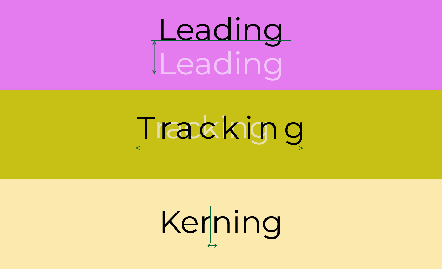
Kerning: The spacing between two specific letters. (For example, making sure a "W" and
an "A" don't smash into each other).
Tracking: The overall spacing across a whole word or line of text. Widening the tracking
gives your text a premium, airy, breathable feel.
Leading (Line Spacing): The vertical space between lines of text. If your leading is too
tight, the lines crush together and become unreadable. Giving your paragraphs some
breathing room makes reading effortless.
The Golden Rules of Mixing Fonts
How do you pick two fonts that look beautiful together on a website without causing a
visual headache? Follow these three simple golden rules:
Rule 1: Limit Yourself to 2 Fonts Max
The biggest mistake beginners make is using 4 or 5 different fonts on one page. It looks messy
and amateur. Stick to one font for your headings and one font for your body paragraph text. That’s it!
Rule 2: Create Strong Contrast
If you use two fonts that look almost identical, it looks like a mistake. Instead,
pair opposite styles together.
The Perfect Recipe: Use a bold, strong Serif font for your headings,
and a clean, highly readable Sans-Serif font for your paragraph text.
Rule 3: Prioritize Readability Over Everything
A font can look incredibly cool, but if your website visitors have to squint their
eyes to read your blog post, they will hit the "back" button instantly.
Clear beats clever every single time.


Related Blogs